US Healthcare System Map
An opensource work in progress by
GoInvo
Draft project outline
Last update on 28.Nov.2022.
Send us your feedback at ushealthcaremap@goinvo.com
Problem
There is no single diagram or map of the US healthcare system that effectively describes the main actors and relationships between actors.
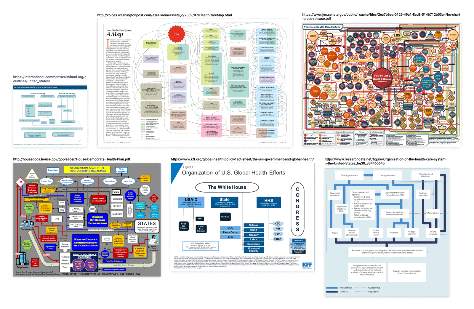
Unfortunately, current healthcare system maps are too narrowly focused and/or struggle to clarify the complexity of the system (see examples below). The US healthcare system is complex, and we (healthcare policy makers, patients, medical students, etc) would benefit from a dynamic System Map.
Our Goal
Our goal at GoInvo is to create and open source map of the US healthcare system. Currently, we are in the process of outlining and designing the map. Ultimately, we hope to build an interactive, mobile-friendly map.
Impact
We hope to not only shine a light on the structure of the US healthcare system but to create an opensource resource for academics, healthcare analysts, health IT engineers and designers, entrepreneurs finding their place in the system, healthcare governance and policymakers, patients, and more.
Initial Work
Early Concepts
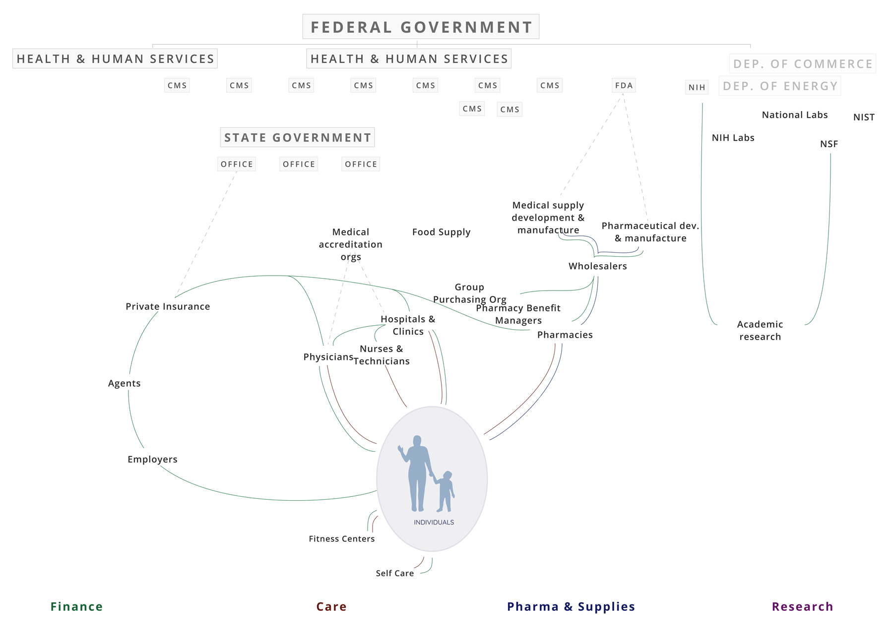
We began by mapping out governance bodies.
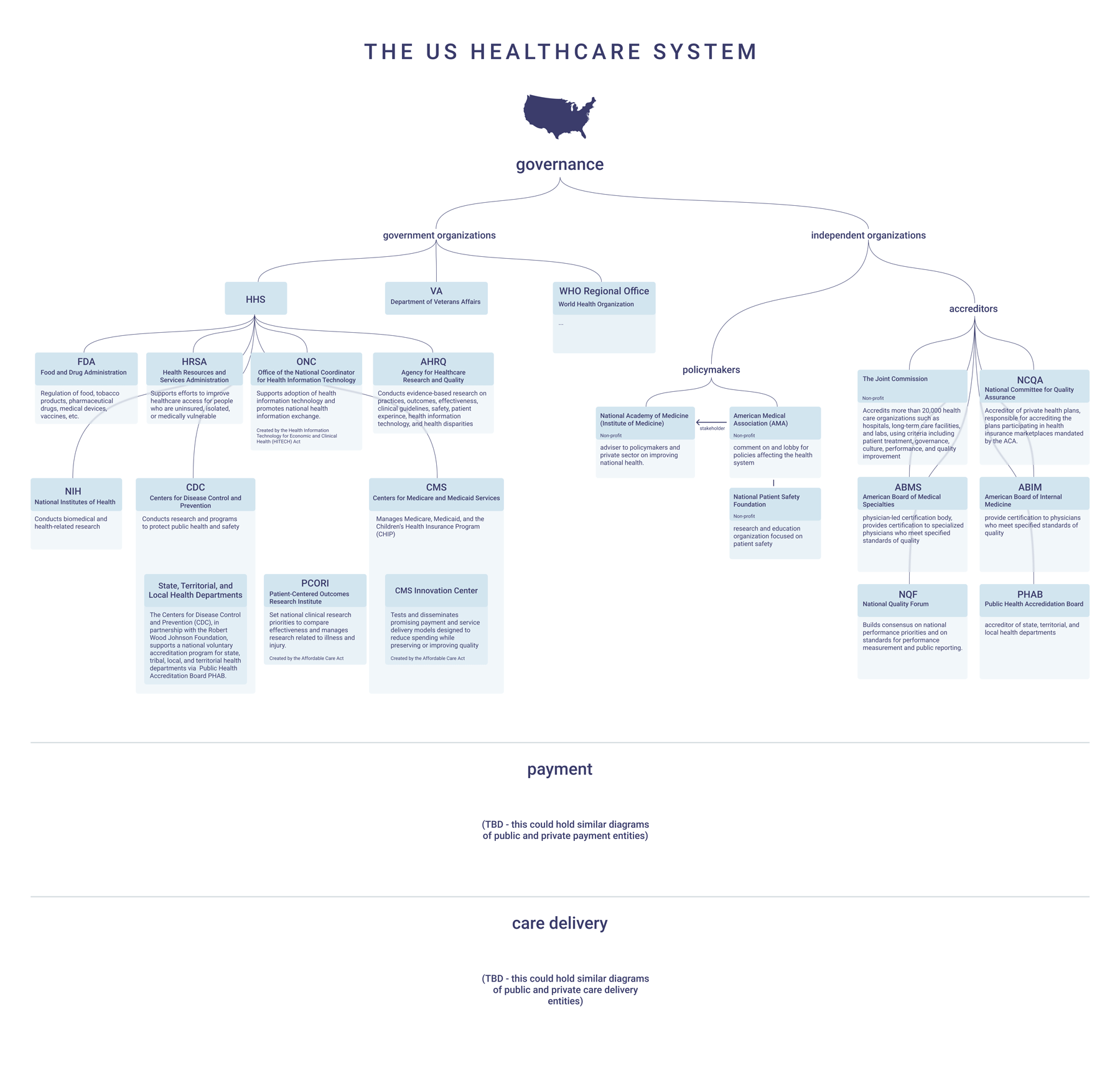
This kind of hierarchical diagram became lengthy very quickly, so we started to explore a layout and map that could reflect various key roles in the Healthcare System (Research, Pharma, Care, Payment).
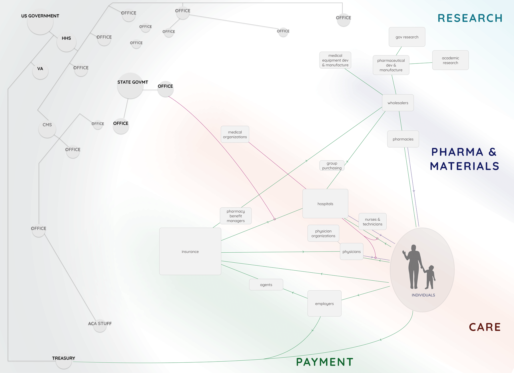
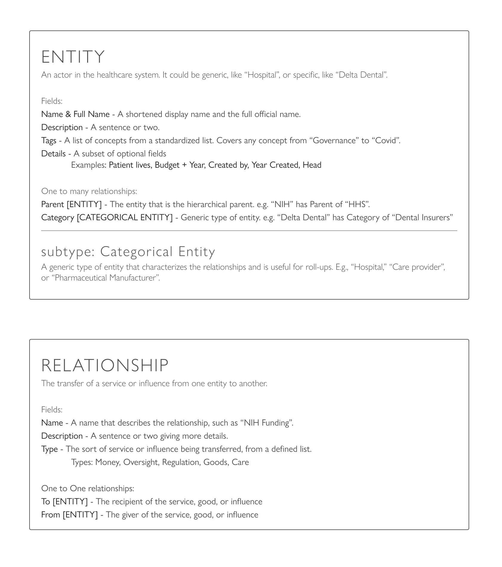
Data Model
As we dug deeper and got a feel for the actors at play, we explored data models to represent the complexity of different types of players, their organization, and the relationships between them. This allowed us to step sideways from the challenge of visualizing the system, and focus on describing or defining the system in parallel. With a robust data model and database in hand, we will construct custom views to zero in on whatever lens, and facet, or detail is of interest in the system.
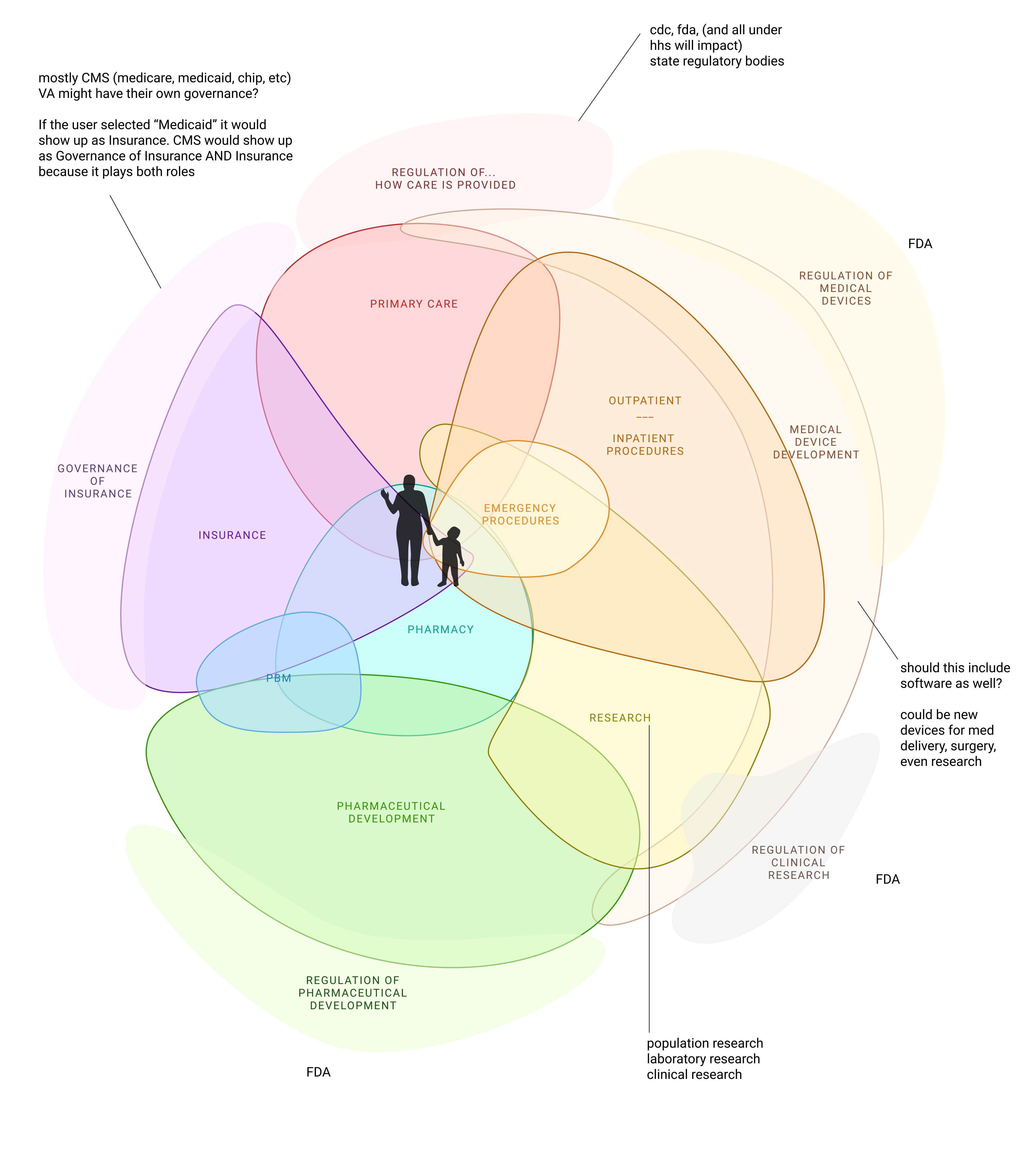
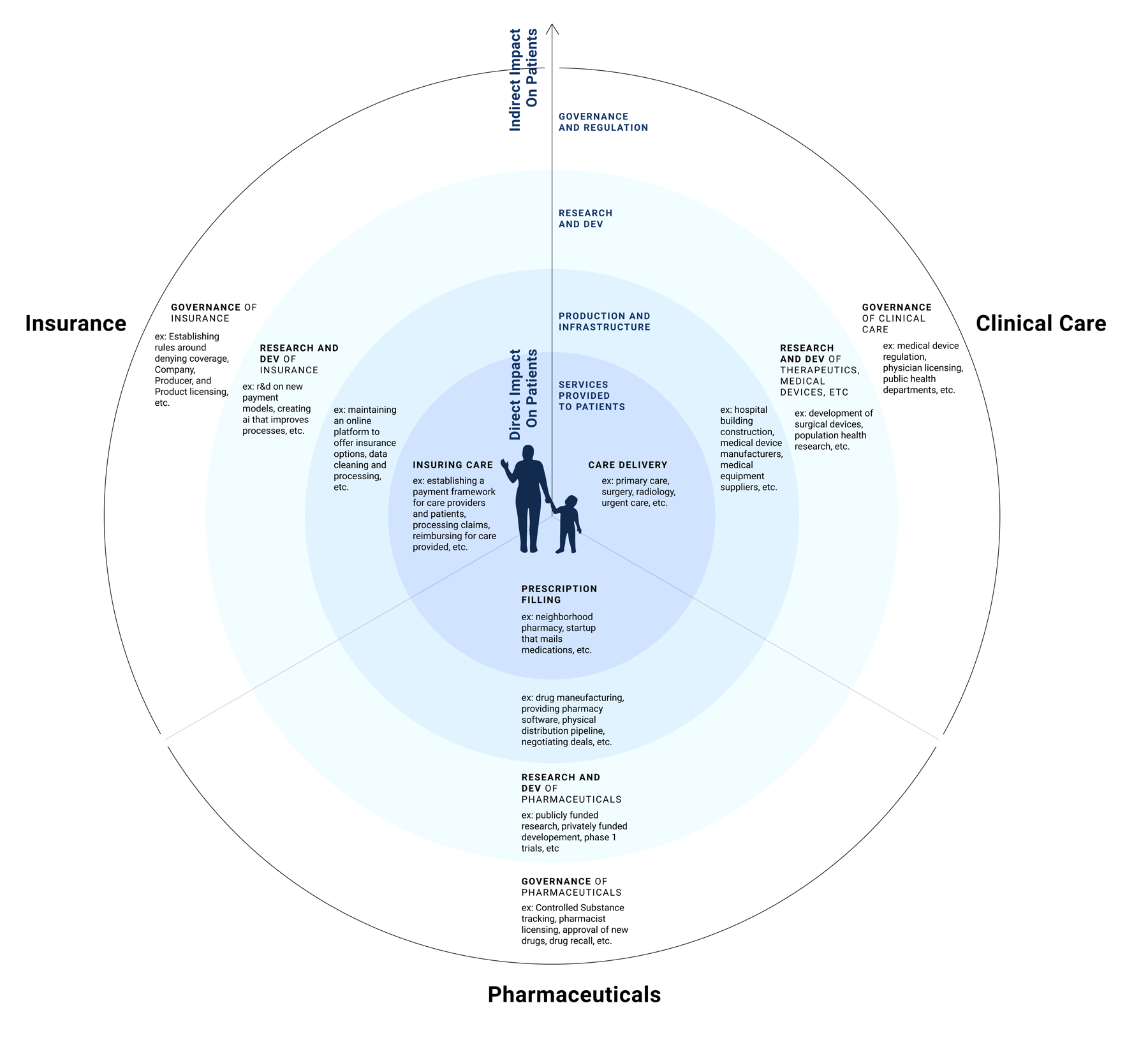
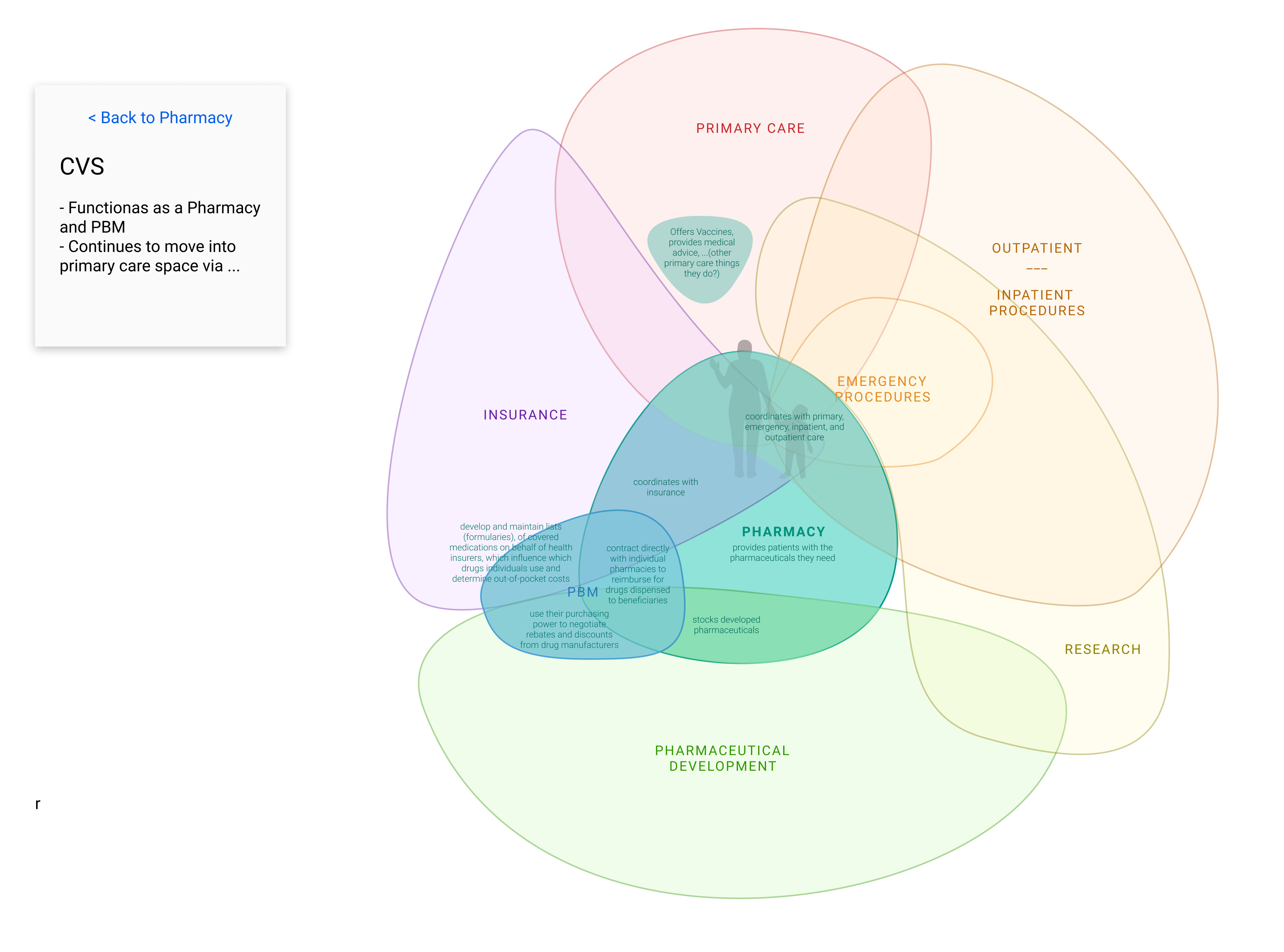
Mapping Roles VS Entities
Going through this process, we realized that "Entities" (like CVS) hardly ever stick to consistent "Roles" (such as filling prescriptions). Even in that example, CVS expands their role to Pharmacy benefit Manager and even some primary care delivery. Trying to create a map that shows how all of these Roles fit together is nearly impossible because each Entity often expands their roles in different ways. Healthcare isn't clear cut. One way to handle this complexity is to map out general roles and then place entities on top of that map. See the examples below.
In this final concept, we look at a potential way to interact with the diagram.
Mapping Entities onto the Landscape of HC Roles
(note: this diagram isn’t comprehensive. We've kept it simple for proof of concept)
1. View the whole landscape
of high level roles in healthcare.
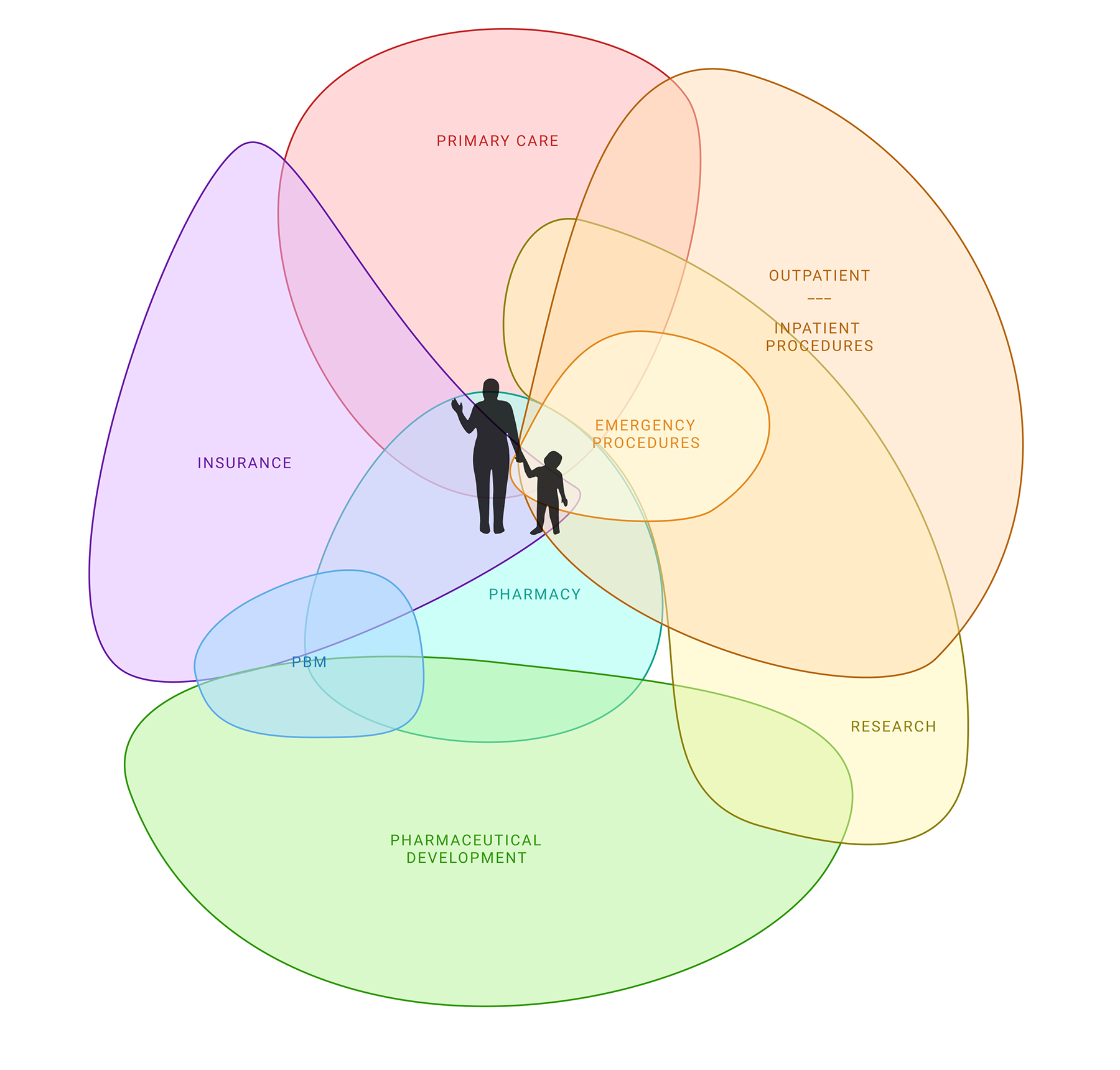
2. Click on one of the Roles/Categories to learn more about it and how it connects to other roles.
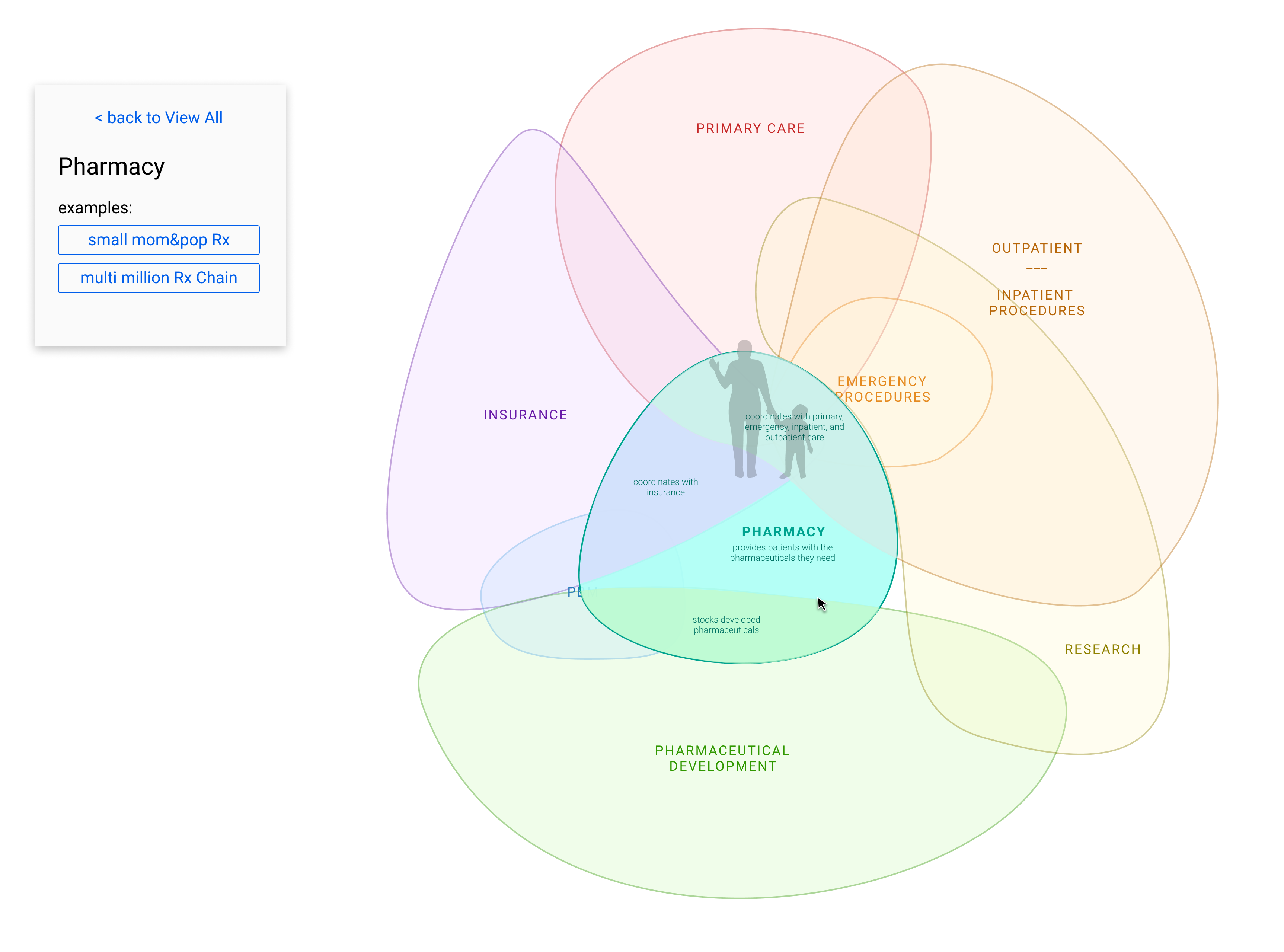
3. Explore specific entities (such as CVS in this case) which may perform more than one role.
General layout/organization of information focused on role based categories.
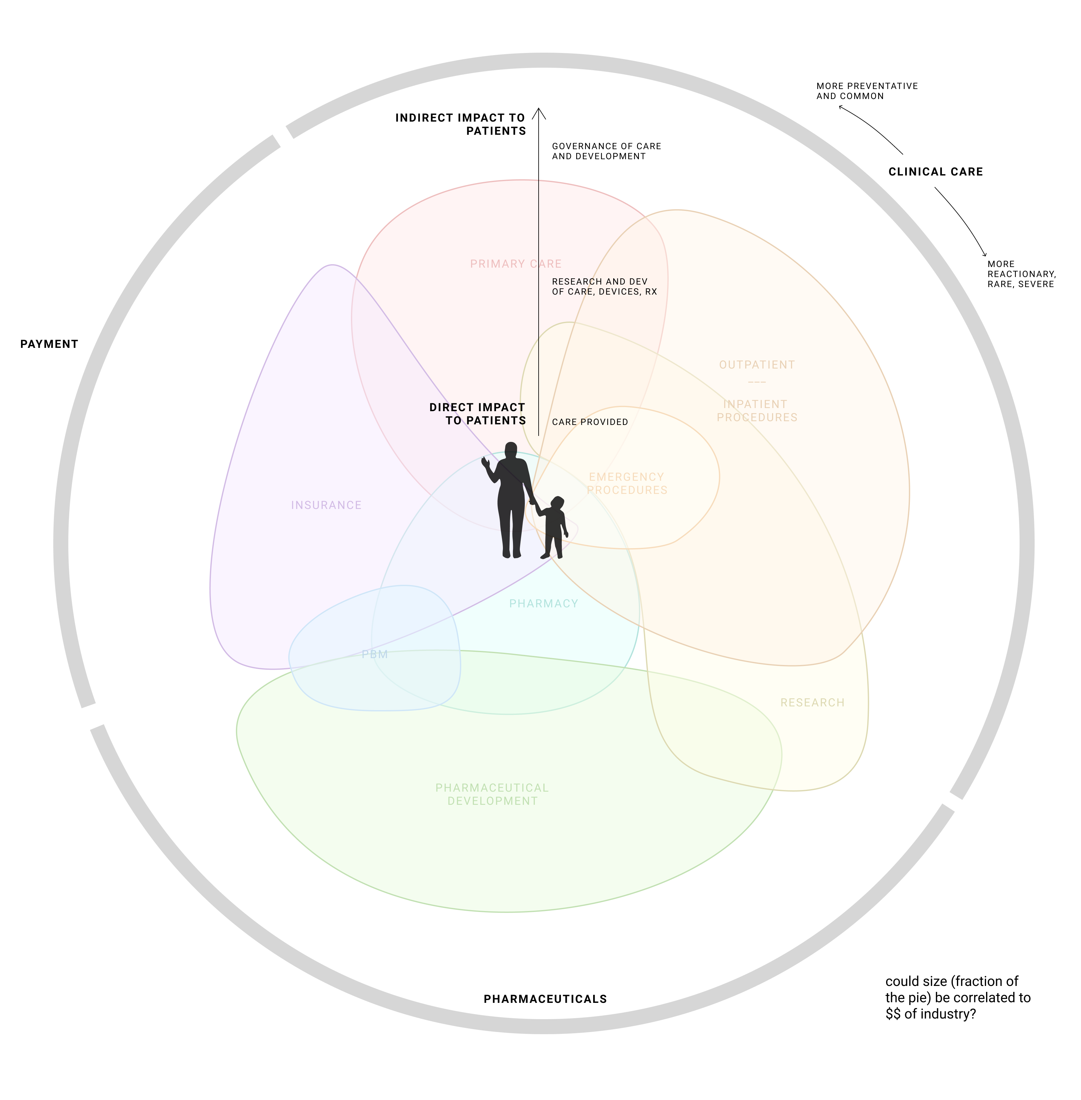
Still working on what are the Roles/Categories and which ones are CONNECTED.
Note that any specific entity such as FDA would show up in the same kind of way that CVS did,
highlighting any role it plays. Ideally, the sizes and shapes would be meaningful (right now they
are just about defining connection to other roles). I’ve clarified and determined more of an
organizational layout (above). We should update this based on that thinking.